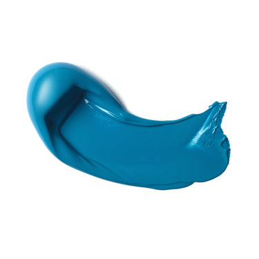
The big blue. Meet cerulean blue, an inorganic synthetic mineral pigment known as PB35. What color is cerulean? It’s a rich blue pigment with green undertones. The word cerulean derives from the Latin caeruleum meaning sky or sea, a fitting inspiration for a color so blue.
Is cerulean blue warm or cool? Cerulean blue is a bright, semi-transparent greenish-blue, and is useful as a cool blue on the palette. With uniformly fine, rounded particles, it doesn’t react to light or chemicals, giving reliable permanence. Very stable and lightfast, PB35 is expensive to produce, making it a Series 3 color in all our ranges.
HISTORY AND ORIGIN
From natural inspirations to modern invention. After the French chemist Louis Jacques Thénard discovered cobalt blue in 1802, based on the 8th and 9th century blues used in Chinese porcelain, Swiss chemist Albrecht Höpfner created the cerulean blue color in his lab by mixing cobalt blue with calcinated tins, salts and silica. The resulting pigment was a cobalt stannate, essentially a tint of cobalt blue. It wasn’t until 1860 that English colorman George Rowney helped make cerulean blue more widely available under the trade name Coeruleum. It became a staple on the artists’ palette quickly after.
CERULEAN BLUE IN THE ART WORLD
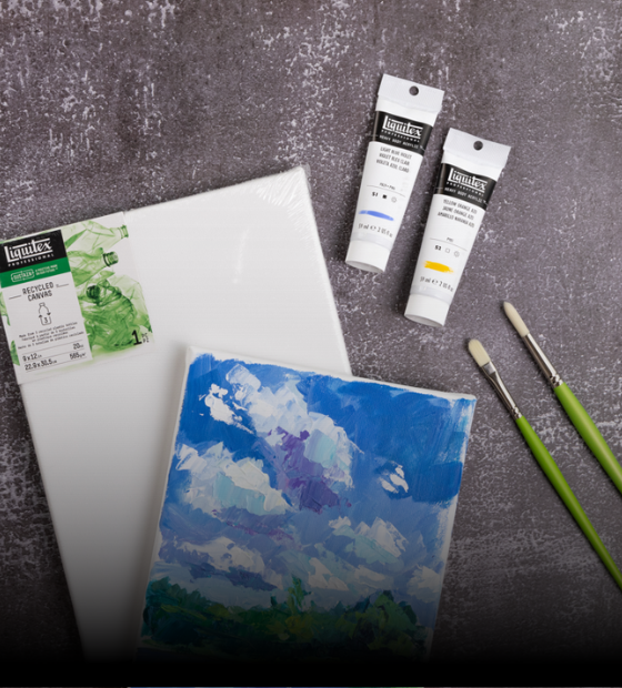
Cerulean blue – along with cobalt blue, synthetic ultramarine and others - became part of a new set of colors quickly adopted by artists of the time. Painter Jehan Georges Vibert called these intense pigments his ‘dazzlers’. Impressionist artist Pissarro claimed to have banished the old, dull ‘earth’ colours from his palette, and Monet mixed his ochres and khakis from complex combinations of the new, bright pigments. Cerulean blue paint was particularly popular in skyscapes. See it in the sky of Monet’s 1877 La Gare Saint-Lazare, Édouard Manet’s 1878 Corner of a Café-Concert and the pointillism of Paul Signac. Berthe Morisot used it for the blue coat of the woman in her Summer's Day, 1879.
The color is still a favourite. Pantone nominated it as their Color of the Millennium in 1999, saying “Psychologically, gazing at a blue sky brings a sense of peace and tranquillity to the human spirit. Surrounding yourself with cerulean blue could bring on a certain peace because it reminds you of time spent outdoors on a beach, near the water – associations with restful, peaceful, relaxing times.”
CERULEAN BLUE IN POP CULTURE
Cerulean blue has a starring moment in the 2006 film The Devil Wears Prada. Meryl Streep’s character, powerful magazine editor Miranda Priestly, uses it to lecture her new assistant on the cultural influence of color. “What you don’t know is that that sweater is not just blue, it’s not turquoise, it’s not lapis, it’s actually cerulean. You’re also blindly unaware of the fact that in 2002, Oscar de la Renta did a collection of cerulean gowns. And then I think it was Yves St Laurent, wasn’t it, who showed cerulean military jackets? And then cerulean quickly showed up in the collections of eight different designers. Then it filtered down through the department stores and then trickled on down into some tragic ‘casual corner’ where you, no doubt, fished it out of some clearance bin.”
HOW TO USE CERULEAN BLUE IN YOUR ART PRACTICE
Why is cerulean blue so expensive? There are reasons it’s a highly prized pigment, especially for portraiture. At first cerulean blue appears strongly on the palette, but as you mix it with other colors, it becomes much weaker in strength. This low tinting strength is its superpower. On the palette, it gives all sorts of options for creating a range of subtle atmospheric effects – for sky, sea and skin tones and beyond. Try it and see.
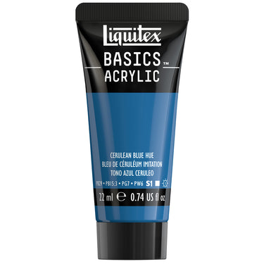
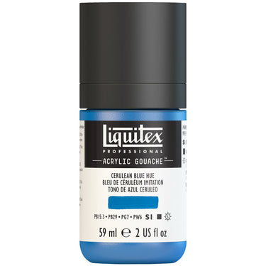
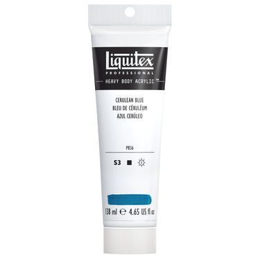
You can explore cerulean blue is in our Heavy Body and Soft Body ranges.






![LQX BASICS ACRYLIC CERULEAN BLUE HUE [SWATCH]](http://www.liquitex.com/cdn/shop/files/140826_375x375_crop_center.jpg?v=1733438908)
![LQX ACRYLIC GOUACHE 470 CERULEAN BLUE HUE [WEBSITE SWATCH]](http://www.liquitex.com/cdn/shop/files/71501_375x375_crop_center.jpg?v=1693229363)
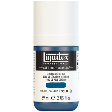
![LQX SOFT BODY ACRYLIC 470 CERULEAN BLUE HUE [WEBSITE SWATCH]](http://www.liquitex.com/cdn/shop/files/71893_375x375_crop_center.jpg?v=1693228636)

![LQX ACRYLIC MARKER SET 6X 2-4MM CLASSICS [CONTENTS] 887452001225](http://www.liquitex.com/cdn/shop/files/68762_375x375_crop_center.jpg?v=1707320720)
![LQX PRO MEDIUMS POURING MEDIUM [WEBSITE SWATCH]](http://www.liquitex.com/cdn/shop/files/72030_375x375_crop_center.jpg?v=1705607484)
![LQX PRO MEDIUMS GESSO [WEBSITE SWATCH]](http://www.liquitex.com/cdn/shop/files/72009_375x375_crop_center.jpg?v=1693098231)
![LQX BASICS 6x118ML SET 887452059226 [SET WITH CONTENTS 2]](http://www.liquitex.com/cdn/shop/files/130398_375x375_crop_center.jpg?v=1707324060)
![LQX BASICS 6x118ML SET 887452059226 [FRONT]](http://www.liquitex.com/cdn/shop/files/130396_375x375_crop_center.jpg?v=1706797707)
![LQX BASICS 24X22ML PAINT SET 887452028543 [FRONT]](http://www.liquitex.com/cdn/shop/files/80833_375x375_crop_center.jpg?v=1706780423)