


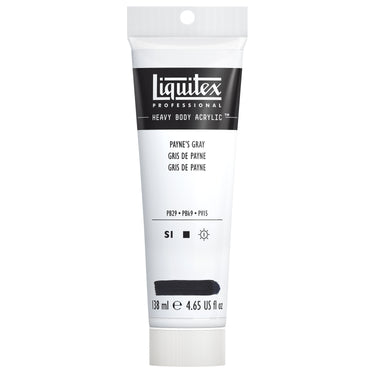
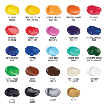
Welcome to Payne’s Gray, the moody dark blue gray that gives us a more naturalistic – and super-useful - alternative to black. Always a composite color made up of three pigments, Liquitex Payne’s Gray is a mix of PB29 (ultramarine blue), PBk9 (bone black) and PV15 (ultramarine violet).
THE ORIGINS
Payne’s Gray is named after its creator, William Payne, a British watercolorist born in Devon in 1760. Originally an engineer, Payne became renown as a teacher of watercolors in London and had some success as a painter. It’s believed he mixed his signature color while trying to make something less intense than black for his rural landscape scenes. To create it, Payne used Prussian blue, yellow ochre and crimson lake.
The first recorded use of the color name was in 1835. Over the centuries, many different recipes have been used to make Payne’s gray. Some have used indigo instead of Prussian blue, other burnt sienna, now most brands use a mix of ultramarine and a carbon-based black. Each of the main materials makers now has their own version of Payne’s Gray.
IN THE ART WORLD
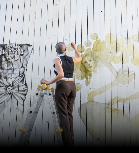
William Payne first used his new color to create atmospheric perspective in his watercolor paintings. He creates the impression of distance using it increasingly more diluted as he moves from front to back, giving a natural, graduation effect. His work is found at the Tate in London and the National Gallery of Art in Washington, DC. British contemporary painter George Shaw is a fan of this moody gray. The Turner Prize nominee focuses on suburban scenes and named his 2011 collection of monochromatic watercolors, “Payne’s Gray”. He’s also quoted in The Guardian newspaper as saying that Payne’s gray is “the color of English rain”.
ON THE PALETTE
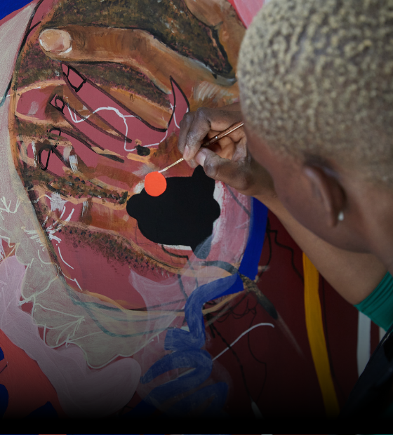
Payne’s Gray does have a certain melancholy mood about it. If you want a clean radiant mix this isn’t the place to start. Due to its composite nature, it'll produce a muddy effect which is useful for all sorts of purposes – from shading to portraiture. Because of its blue undertones, it makes interesting deep, leafy greens when mixed with yellows, - ideal for foliage and botanical painting. It’s usually very dark in masstone and has blue undertones when diluted. When used in place of true black, Payne’s Gray gives life to storm clouds, moody landscapes, mist, dramatic seascapes, rocky outcrops, and distant mountains. It’s also useful for underpainting and for monochrome compositions.
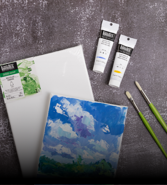
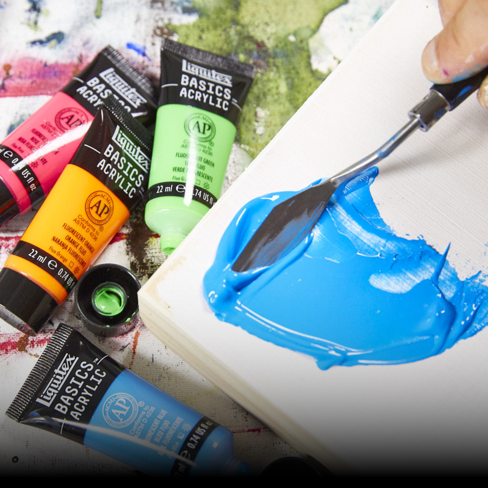
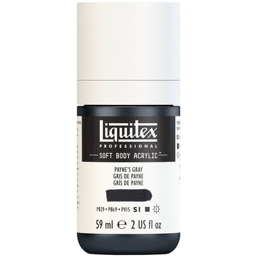
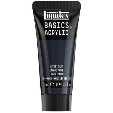
Payne’s Gray can be found in Heavy Body, Soft Body, Basics Acrylic Color and Basics Acrylic Fluid.
![LQX SOFT BODY ACRYLIC 310 PAYNES GRAY [WEBSITE SWATCH]](http://www.liquitex.com/cdn/shop/files/71858_375x375_crop_center.jpg?v=1693228814)
![LQX BASICS ACRYLIC PAYNES GRAY [SWATCH]](http://www.liquitex.com/cdn/shop/files/140856_375x375_crop_center.jpg?v=1735736752)
![LQX BASICS FLUID ACRYLIC 118ML PAYNES GRAY 887452056157 [NA]](http://www.liquitex.com/cdn/shop/files/112738_375x375_crop_center.jpg?v=1698860501)
![LQX BASICS ACRYLIC FLUID 310 PAYNES GREY[WEBSITE SWATCH]](http://www.liquitex.com/cdn/shop/files/113193_375x375_crop_center.jpg?v=1698860501)
![LQX ACRYLIC MARKER SET 6X 2-4MM CLASSICS [CONTENTS] 887452001225](http://www.liquitex.com/cdn/shop/files/68762_375x375_crop_center.jpg?v=1707320720)
![LQX PRO MEDIUMS POURING MEDIUM [WEBSITE SWATCH]](http://www.liquitex.com/cdn/shop/files/72030_375x375_crop_center.jpg?v=1705607484)
![LQX PRO MEDIUMS GESSO [WEBSITE SWATCH]](http://www.liquitex.com/cdn/shop/files/72009_375x375_crop_center.jpg?v=1693098231)
![LQX BASICS 6x118ML SET 887452059226 [SET WITH CONTENTS 2]](http://www.liquitex.com/cdn/shop/files/130398_375x375_crop_center.jpg?v=1707324060)
![LQX BASICS 6x118ML SET 887452059226 [FRONT]](http://www.liquitex.com/cdn/shop/files/130396_375x375_crop_center.jpg?v=1706797707)
![LQX BASICS 24X22ML PAINT SET 887452028543 [FRONT]](http://www.liquitex.com/cdn/shop/files/80833_375x375_crop_center.jpg?v=1706780423)
![LQX MATTE POURING MEDIUM SET [CONTENTS] 887452048695 [NA]](http://www.liquitex.com/cdn/shop/files/96237_375x375_crop_center.jpg?v=1693101616)