


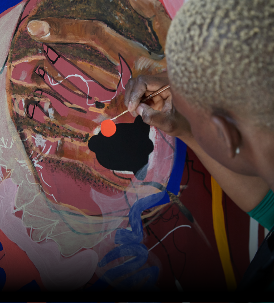

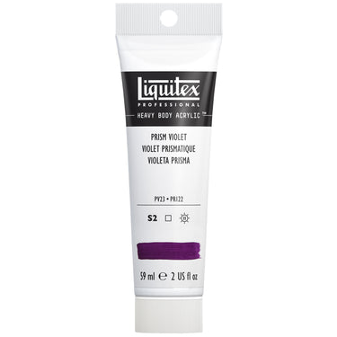
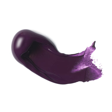
Ready to step into a new dimension? See where your creativity could take you with the deep multi-facetted purple that is Prism Violet. Made up of two pigments, the highly transparent color has warm brown undertones and is named after the refraction caused by light passing through a prism. Let’s take a deeper look.
HISTORY AND MEANING
What’s in a name? The word violet derives from Old French, violet or violete. It was first used in written English in the mid-14th century in The Buke of John Maundeuill, which reports “Men fynd dyamaundz of violet colour” (Men find diamonds of violet color).
Violet is part of the color spectrum in white light, along with red, orange, yellow, green, blue and indigo. In normal life all of the colors are mixed up but can be seen separately when passed through an optical prism. A prism is a transparent optical element, usually made of glass, gemstone or acrylic, with flat, polished surfaces that are designed to refract light. Violet light, in physics, has a short wavelength of 380–450 nanometres and this makes it deviate clearly and become easily visible when passing through a prism.
IN ART
Artists have been drawn to violet shades through history, becoming so popular that ‘violettomania’ was declared at one point. Traditionally, violet purple colors, pigments and dyes were derived from berries, cobalts, carmine and manganese. The French impressionist painter Monet was one of its biggest fans. After studying light and ways to represent it, he began to believe that purple was able to bring the dimensionality of the shadow to life better than black: “I finally discovered the true color of the atmosphere. It is purple”. See how he uses cobalt violet with French ultramarine to create the deepest mauve flowers in Irises and ripples of water in Water-Lilies. Other master artists who were in love with violets include Georgia O’Keefe, Francis Bacon and Rothko.
In 2018 Pantone made Ultra Violet its Color of the Year for it embodiment of “originality, ingenuity, and visionary thinking that points us toward the future”.
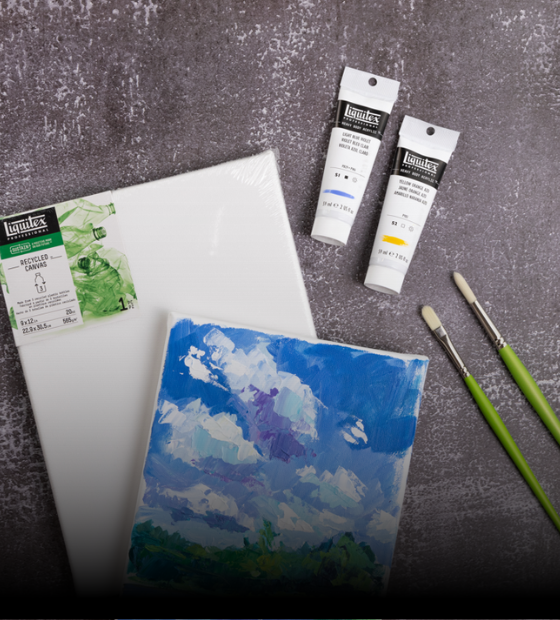
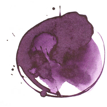
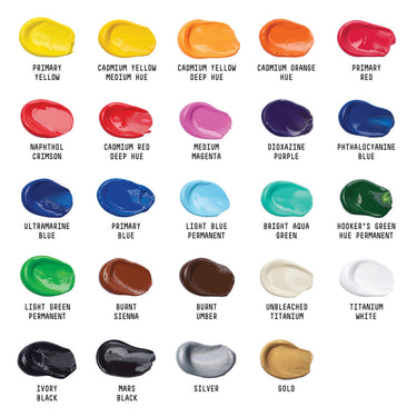
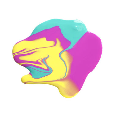
Liquitex Prism Violet is made up two pigments, PV23 and PR122, and give you a versatile spectrum of purples. Highly transparent, use it straight from the pot/tube to discover a dense, moody, almost black, undertone, particularly useful for creating subtle shadows and depths. When tinted with white, it shifts energy, becoming a vibrant mid purple which lends it to lush botanicals, evening light, ripe fruit, water facets and more. Prism Violet sits on the color wheel between red and blue; opposite yellow, which is its complementary color. Try using it against Liquitex Cadmium-Free Yellow Light or Yellow Light Hansa to see it really pop.
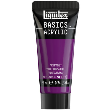
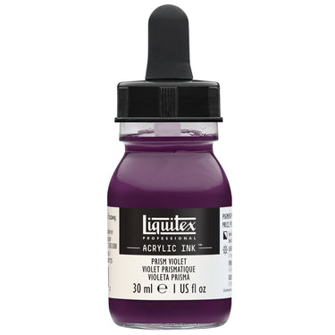
Liquitex Prism Violet is available in Heavy Body, Soft Body, Acrylic Gouache, Acrylic Ink and Basics Acrylic.
![LQX BASICS ACRYLIC PRISM VIOLET [SWATCH]](http://www.liquitex.com/cdn/shop/files/140862_2c43a020-675a-4144-a052-8a705eeb4676_375x375_crop_center.jpg?v=1735736221)

![LQX ACRYLIC MARKER SET 6X 2-4MM CLASSICS [CONTENTS] 887452001225](http://www.liquitex.com/cdn/shop/files/68762_375x375_crop_center.jpg?v=1707320720)
![LQX PRO MEDIUMS POURING MEDIUM [WEBSITE SWATCH]](http://www.liquitex.com/cdn/shop/files/72030_375x375_crop_center.jpg?v=1705607484)
![LQX PRO MEDIUMS GESSO [WEBSITE SWATCH]](http://www.liquitex.com/cdn/shop/files/72009_375x375_crop_center.jpg?v=1693098231)
![LQX BASICS 6x118ML SET 887452059226 [SET WITH CONTENTS 2]](http://www.liquitex.com/cdn/shop/files/130398_375x375_crop_center.jpg?v=1707324060)
![LQX BASICS 6x118ML SET 887452059226 [FRONT]](http://www.liquitex.com/cdn/shop/files/130396_375x375_crop_center.jpg?v=1706797707)
![LQX BASICS 24X22ML PAINT SET 887452028543 [FRONT]](http://www.liquitex.com/cdn/shop/files/80833_375x375_crop_center.jpg?v=1706780423)
![LQX MATTE POURING MEDIUM SET [CONTENTS] 887452048695 [NA]](http://www.liquitex.com/cdn/shop/files/96237_375x375_crop_center.jpg?v=1693101616)