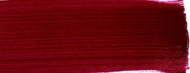
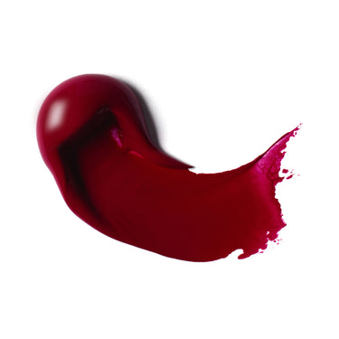
Quinacridone magenta is a rich deep violet-red with high transparency. Popping with vibrancy, this high performance organic synthetic pigment is from the synthetic quinacridone family, has exceptional longevity and is used to make single pigment paints with exceptional clarity. The magenta in its name comes from a lake color named in 1859 after the battle in Magenta, Italy. Let’s take a look at the pigment scientifically known as PR122.
ORIGINS
The quinacridone family includes a wide range of high-impact pigments synthesized in the lab which gives us a spectrum of colors from yellow, through to orange, red and violet. These all have a high-performance mix of high strength color and great transparency.
First noticed as a by-product of chemical research in 1896, its potential wasn’t fully recognized until 1955 when W. Struve, a chemist at the DuPont company, saw the possibilities and went on to mass produce it. Once a commercial method of synthesizing quinacridone pigment was developed, our sister brand Winsor & Newton was the first to make quinacridone magenta for artists. Its stability, lightfastness and color consistency quickly made it a useful alternative to the intensely hued but quick fading alizarin reds.
Particle size determines the exact hue of a quinacridone pigment, as well as small differences in the crystalline structure of its molecules. A latticed structure makes a pinky-red, while a more linear structure gives more of an orange hue.
QUINACRIDONE MAGENTA USES
Vibrant. Cool. Deep. Transparent. A pink that teeters on purple. Quinacridone magenta pigment is unique due to its high color impact, combined with sheer transparency. This gives it many uses for the artist and wider world. Reliably strong in color, the pigment delivers every time: all-round high-performance, super stable, with good resistance to heat, light and solvents. For these reasons, it’s used widely by industry in the cosmetics, cars and plastics manufacturing processes. In the art world, quinacridone magenta (and its sister quinacridone pigments) were quickly picked up by artists of the abstract expressionist movement, who added it to their palettes for its reliability, intensity of color and sheer versatility.
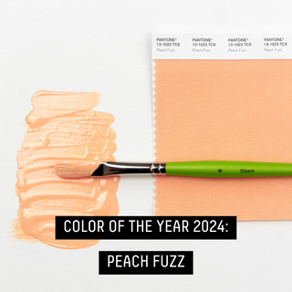
Useful for botanicals and flowers, Quinacridone Magenta has a bright luminosity that is perfect for glazing techniques when mixed with Glazing Medium. Mix it with ultramarines to create deep violet colors, earthy yellows (such as ochre and sienna) give you beautifully rich reds and oranges. Mix these with white to create Pantone Color of the Year 2024-style peaches.
Mix with Yellow Light Hansa to create clear, clean, bright oranges, with a beautiful transparency perfect for glazing. For your coolest orange, use Quinacridone Magenta and Yellow Light Hansa. Quinacridone Magenta is one of the most versatile and cleanest reds for color mixing.
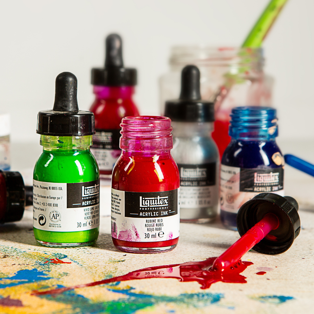
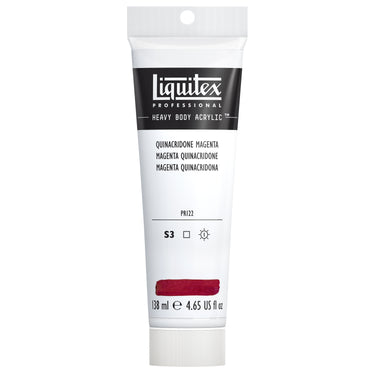
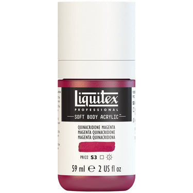
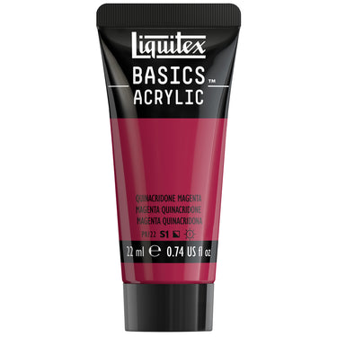
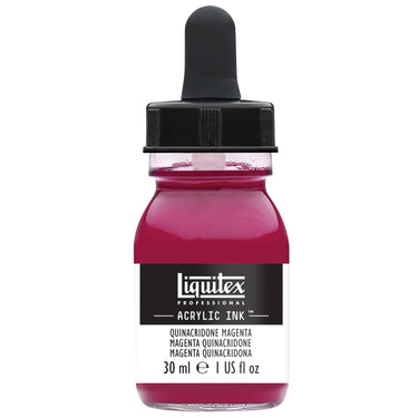
This color is available in both Liquitex Pro and Basics collections. Find it as Heavy Body, Soft Body, Acrylic Gouache, Acrylic Ink, Basics Acrylic and Basics Fluid Acrylic.







![LQX SOFT BODY ACRYLIC 114 QUINACRIDONE MAGENTA [WEBSITE SWATCH]](http://www.liquitex.com/cdn/shop/files/71830_375x375_crop_center.jpg?v=1693228869)
![LQX BASICS ACRYLIC QUINACRIDONE MAGENTA [SWATCH]](http://www.liquitex.com/cdn/shop/files/140866_c7594e81-23ae-4ee9-a063-87f5e3bd3813_375x375_crop_center.jpg?v=1733413118)


![LQX ACRYLIC MARKER SET 6X 2-4MM CLASSICS [CONTENTS] 887452001225](http://www.liquitex.com/cdn/shop/files/68762_375x375_crop_center.jpg?v=1707320720)
![LQX PRO MEDIUMS POURING MEDIUM [WEBSITE SWATCH]](http://www.liquitex.com/cdn/shop/files/72030_375x375_crop_center.jpg?v=1705607484)
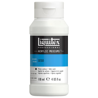
![LQX PRO MEDIUMS GESSO [WEBSITE SWATCH]](http://www.liquitex.com/cdn/shop/files/72009_375x375_crop_center.jpg?v=1693098231)
![LQX BASICS 6x118ML SET 887452059226 [SET WITH CONTENTS 2]](http://www.liquitex.com/cdn/shop/files/130398_375x375_crop_center.jpg?v=1707324060)
![LQX BASICS 6x118ML SET 887452059226 [FRONT]](http://www.liquitex.com/cdn/shop/files/130396_375x375_crop_center.jpg?v=1706797707)
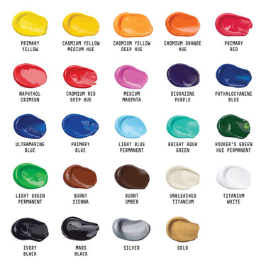
![LQX BASICS 24X22ML PAINT SET 887452028543 [FRONT]](http://www.liquitex.com/cdn/shop/files/80833_375x375_crop_center.jpg?v=1706780423)